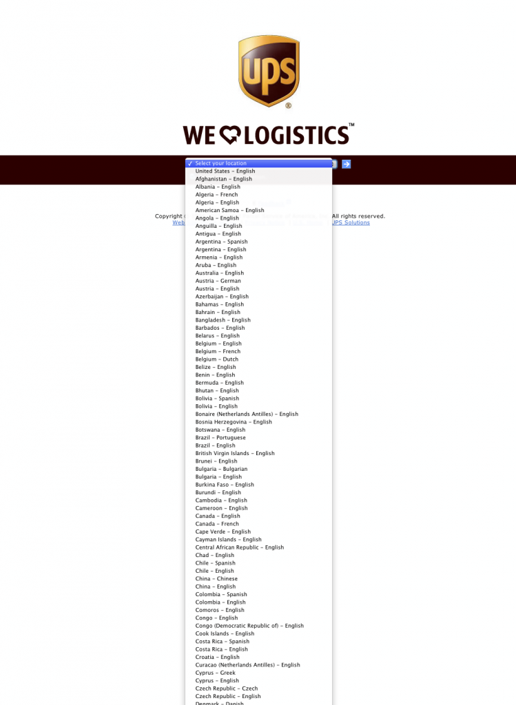
How many times have you seen the UPS landing page below?
Why is it that neither FedEx nor UPS know about geolocation of IP addresses? Even if geolocation was used just as a hint or an obvious way was provided to change it if the geolocation went wrong, far fewer folks would hit these screens. And after you make a selection, the UPS site just sits there and does nothing until you click the small blue botton.
I hate software that makes me deal with pop quizzes and stupid modal dialogs. Hey, where are you? Would you like fast or small? Want to update now? Restart Firefox now? Hey, you will need to reboot after you install this, OK? Downloading this RPM will use 30 KB of disk space, sound good? Really quit? There’s an item on your calendar coming up in 10 minutes, you won’t be able to click anywhere in Gmail until you click this OK button… on all of your computers. I couldn’t copy that to the clipboard. Send a bug report to Apple? This document has ColorSync profile 1, and this other one has ColorSync profile 2. Would you like me to alert when submitting a form to an unencrypted site? There was an error with your request, try again later. All the downloadable content has downloaded. I am going to go ahead and join you to the unsecured network ‘linksys’. Hey, couldn’t backup this computer. Holy shit, there’s new software available, I don’t care if you’re watching a movie fullscreen (iTunes + Notification Center). Psst, mind if I phone home real quick? Oh, by the way, the iTunes terms and conditions have changed and I suddenly can’t remember your credit card number.
Who wouldn’t hate a machine that talks to you this way, all day, every day? I am trying to get some work done here, and you’re telling me all this out-of-band shit and very little of it is useful to me right now.
Please stop asking me questions. I don’t know what the answer is and you’re interrupting my train of thought, which I value far more than pondering any of the above questions.

